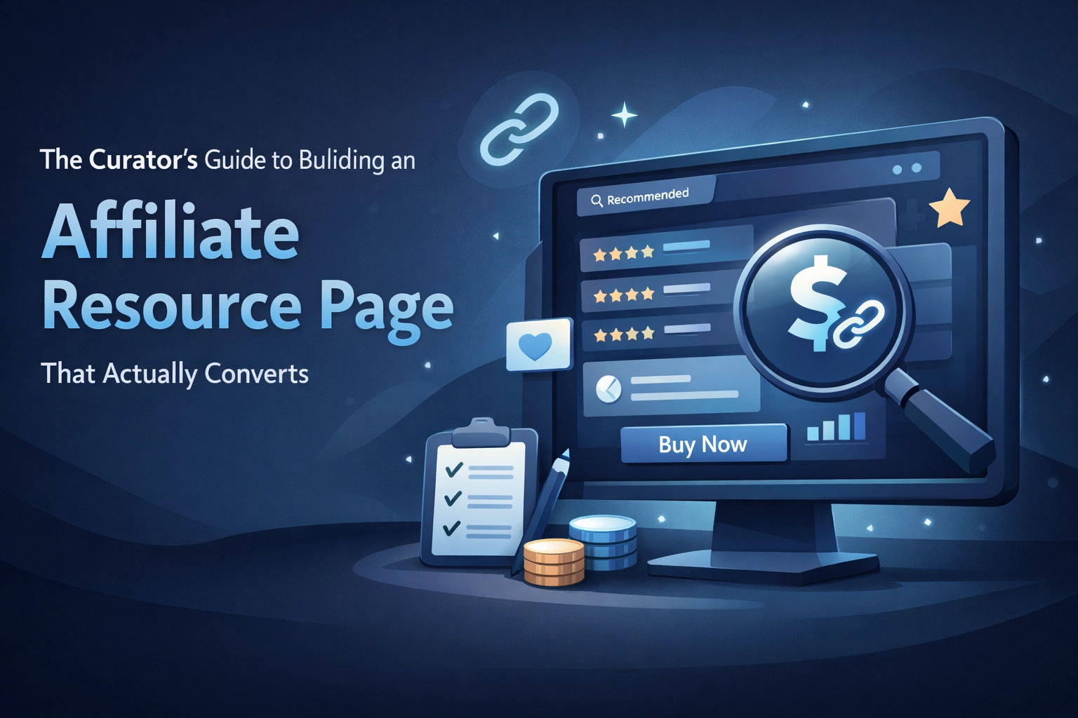
Most affiliate resource pages fail because they read like shopping catalogs. You know the ones, endless product grids, affiliate links everywhere, zero personality. Your visitors can smell the commission-chasing from a mile away.
Here's what actually works: building a resource page that feels like getting recommendations from a knowledgeable friend. Not a sales pitch. Not a link dump. A genuinely helpful collection that your audience actually trusts.
Let's break down how to build one that converts.
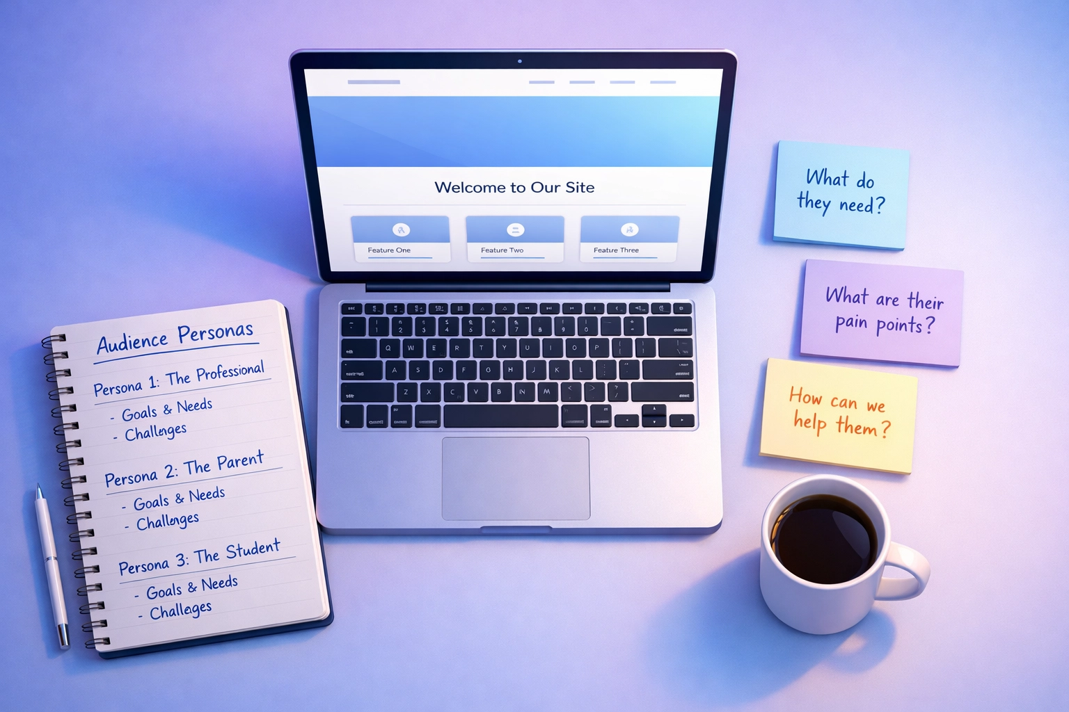
Start With Your Audience, Not Your Wallet
Before you add a single product link, get clear on who you're helping and why they'd even visit this page.
What you get when you nail this:
• Content that answers real questions your audience is already asking
• Higher engagement because visitors see themselves in your recommendations
• Better conversion rates since you're solving actual problems
We think the biggest mistake here is building "resources I want to promote" instead of "resources my audience needs." The distinction matters. One converts. The other doesn't.
Ask yourself: If you removed every affiliate link from this page tomorrow, would your audience still find it valuable? If the answer is no, you're building the wrong page.
Go Deep on Each Recommendation
Nobody converts from "Here's a link to Product X." You need to show you've actually used what you're recommending.
For every product on your page, answer these three things:
• What the product actually is and does
• How you personally use it in your own workflow
• Why someone in your audience should consider it
The "how you use it" part is critical. Share screenshots. Describe your specific workflow. Mention the problems it solved for you. This isn't about writing a full product review: it's about demonstrating genuine experience.
Example: Instead of "Grammarly helps with writing," try "I run every blog post through Grammarly before publishing. It catches the sentence structure issues I miss when I'm too close to my own writing."
See the difference? One feels like a pitch. The other feels like useful information from someone who knows.
Mix Affiliated and Non-Affiliated Products
This is where most people get it wrong. They only recommend products they have affiliate relationships with, and it shows.
Here's what changes when you include non-affiliated recommendations:
• Your page stops feeling like one long advertisement
• Visitors trust you more because you're clearly not just chasing commissions
• You can recommend the actual best option, even if you don't make money from it
Worth checking out: Create a simple notation system. Use ✅ for "we earn a commission if you buy this" and 🧾 for "no affiliate relationship, just think it's solid." Transparency builds trust.
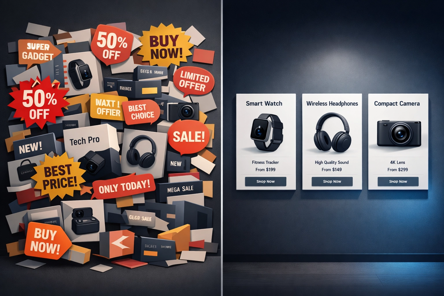
Format Like You Mean It
Walls of text kill conversions. Your resource page needs visual breathing room.
What you get with smart formatting:
• Higher time-on-page metrics because content feels scannable
• Better mobile experience where most of your traffic lives
• Clearer product distinctions that help visitors make decisions
Use categories to group similar resources. Add images for each product: not stock photos, but actual screenshots or product images. Keep spacing consistent between entries.
Link shorteners matter here too. Compare these two URLs:
• yoursite.com/recommends/writing-tools
• amazonassociates.com/tracking?ref=xyz123456789
The first one feels trustworthy. The second one screams "I want your money." Clean links matter more than you think.
Build Trust With Real Signals
Trust signals aren't optional: they're what separates pages that convert from pages that bounce.
Include these elements near your recommendations:
• Actual user testimonials with real names
• Review ratings from legitimate platforms
• Trust badges when relevant
• Your own experience timeline with each product
Place these trust elements close to your call-to-action. If someone's about to click through, seeing "Rated 4.7/5 by 2,000 users" right before the button reinforces their decision.
Feature Community Favorites
Your audience's opinions matter as much as yours: sometimes more.
Create a "Reader Favorites" or "Community Picks" section that highlights what your audience already loves. This works because:
• It shows you listen to your community
• Visitors relate to recommendations from people like them
• It gives you content even if you haven't personally tested everything
You can gather this through surveys, comments, or direct messages. Then showcase it. "Sarah from our community uses this for her podcast workflow" carries weight.
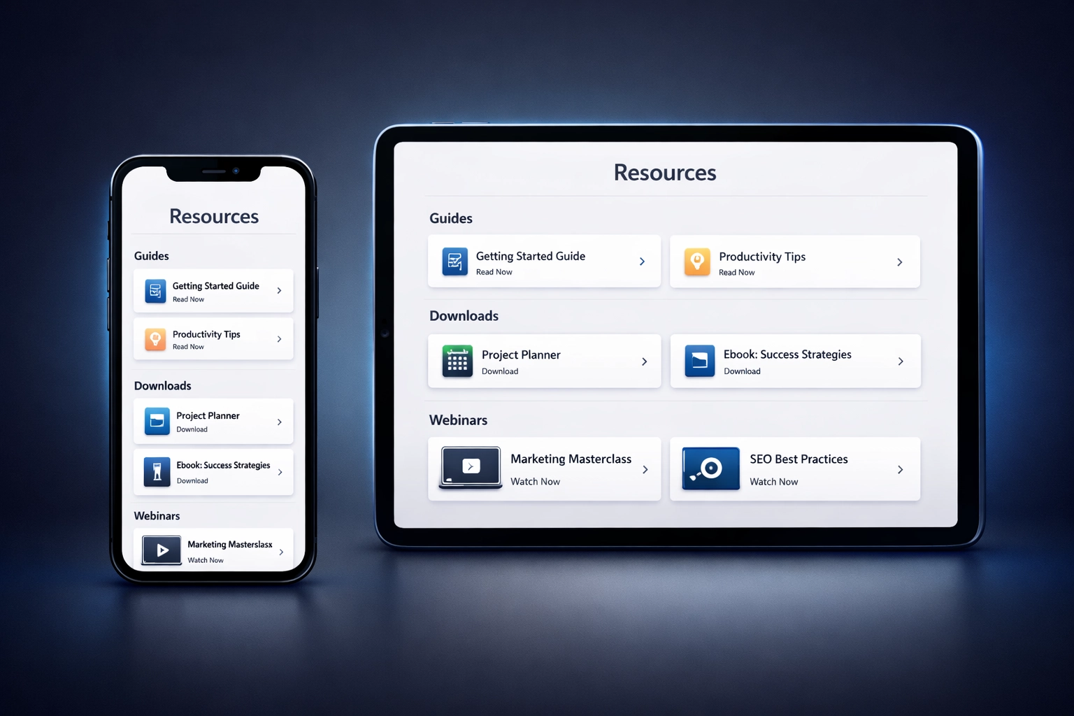
Add Navigation That Actually Helps
Your resource page needs clear wayfinding. Visitors should know exactly what to do next.
What you get with proper navigation:
• Clear categories that let people jump to relevant sections
• CTAs that feel helpful rather than pushy
• FAQ sections that address common hesitations
Put your main CTA above the fold. Repeat it throughout the page where relevant. Use benefit-focused copy like "Check current pricing" instead of "BUY NOW."
An FAQ section handles objections before they become bounce reasons. Address questions about:
• How affiliate tracking works
• Return policies
• Your actual experience with each product
• Why you chose these specific resources

Be Transparent About Affiliates
Let's be straight about this: you need clear disclosure, and not just for legal reasons.
Place your affiliate disclosure where people can actually see it: at the top of your page in plain language. Something like: "Some links on this page earn us a commission if you make a purchase. We only recommend resources we've personally used or thoroughly vetted."
This transparency actually increases conversions. People appreciate honesty. They're fine with you earning money as long as you're upfront about it and your recommendations are solid.
The Real Conversion Secret
Here's what we've learned building resource pages that actually convert: the best ones don't feel like affiliate pages at all. They feel like curated collections from someone who genuinely wants to help.
Your job isn't to sell. Your job is to curate, explain, and guide. The conversions follow naturally when you get that right.
Focus on building a resource that you'd bookmark and return to yourself. Include products you'd recommend even without affiliate commissions. Write descriptions that actually inform rather than just promote.
That's how you build a resource page that converts: not through tricks or tactics, but through genuine usefulness that earns trust.
We maintain resource pages as part of our work in affiliate marketing. Some recommendations on this site include affiliate relationships. We're transparent about this because we think you deserve to know.
Leave a Reply